Data Analysis
Before we start: answer a quick questionnaire
Do: Answer a short questionnaire about this class (2 minutes)
- go to https://pollev.com/charlesmarti205 or scan the QR code
- we’ll use your responses as the dataset for a live analysis demo later in the lecture
Specific Biases
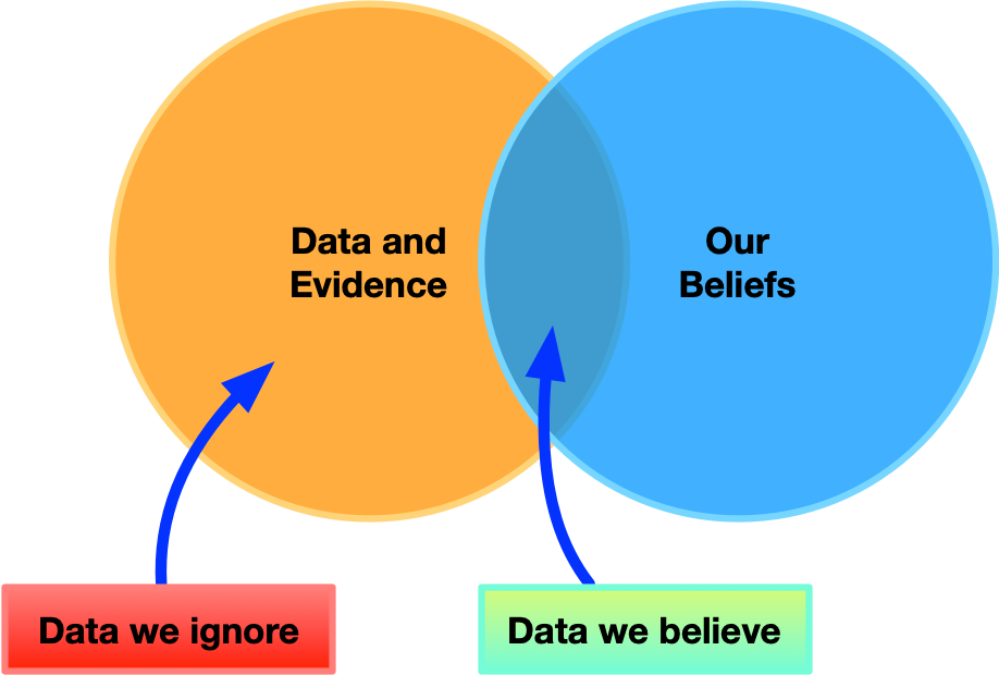
- familiarity bias: do what we know best
- ignore unfamiliar methods
- ignore unfamiliar data sources
- self-attribution bias: giving ourselves too much
credit
- falsely attribute improvements to our design and not external factors, user learning, etc
- overlook alternative explanations
- confirmation bias: discarding information that
contradicts existing belief
- more on confirmation bias
- ignore non-supporting evidence
- analyse for confirmation, not for discovery
- overlook alternative analyses and sources
Normal vs non-normal distributions
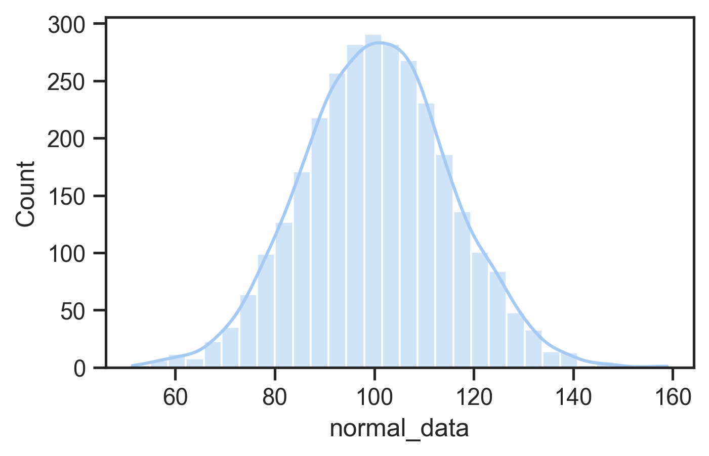
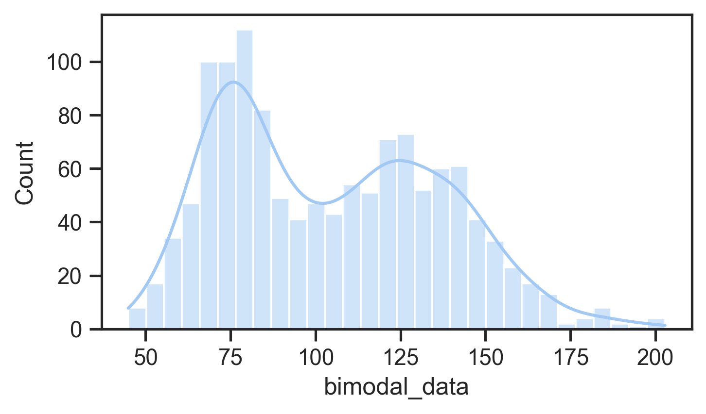
The distribution of the data is how it is spread out and where it is bunched up.
- normal distribution: a.k.a. bell curve, Gaussian distribution, mean, median, mode are the same, and the data evenly falls either side of the mean
- skewed distributions: data with a weirdly long tail in either direction
- multi-modal distributions: data that seems to have multiple bumps
This matters because statistical tests often assume data is normal so findings might be misleading.
Plotting Data
Third thing to do when loading data
- Plot the data to see the distribution and compare data points
- Scatter plot: see all the data! good for checking outliers and comparing aspects of data
- Histogram: useful to check distribution
- Boxplot: useful to compare distributions clearly (more abstract) charles approved plot!
- Bar plots: really just show one value (mean), may not be useful (too abstract!)
- Line plot: useful for showing data over time, not distributions
If plots show something interesting then you can investigate.
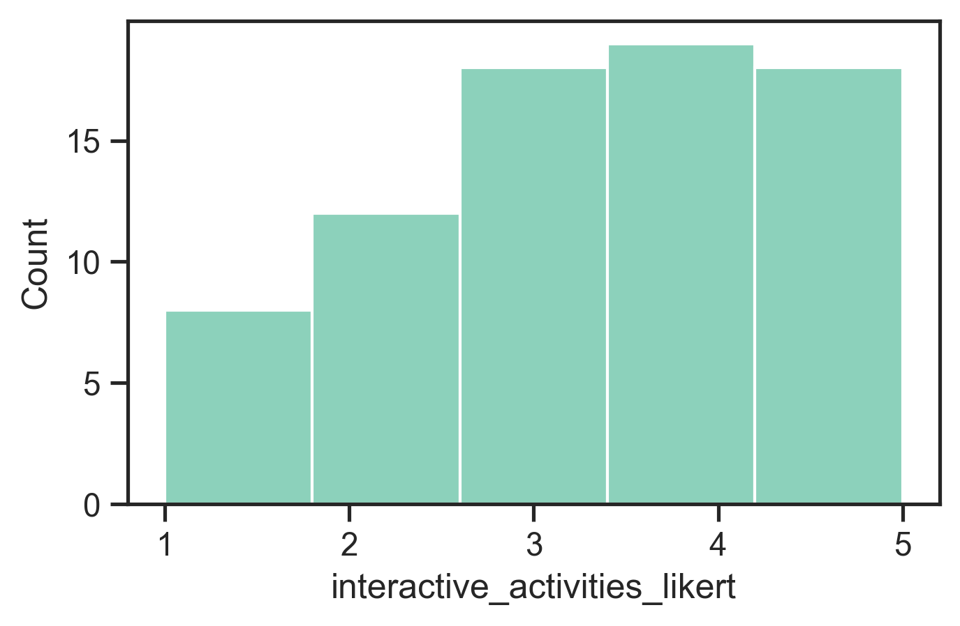
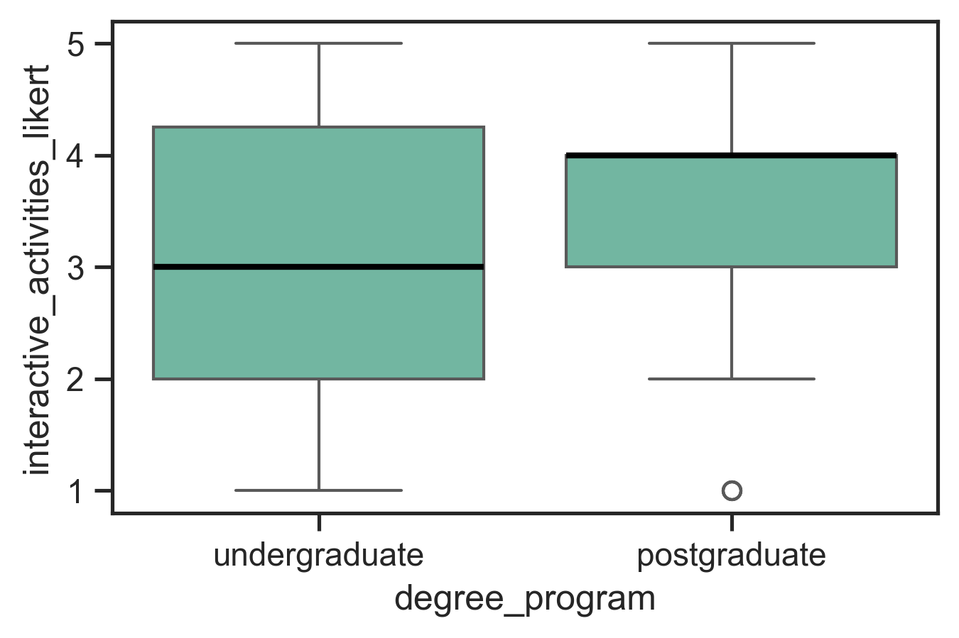
More complex plots
You can get more plots into one plot. Good for surfacing contrasts or telling a story about the data graphically.
sns.set_theme(style="ticks", palette="Set2")
plt.figure(figsize=(10, 6))
sns.boxplot(data=survey_data, x='degree_program',
            y='interactive_activities_likert',
            hue='time_in_canberra',
            medianprops={'linewidth': 2, 'color': 'black'})
plt.savefig('plots/fake_data_complex_boxplot.png',
            bbox_inches='tight', dpi=300)
plt.show()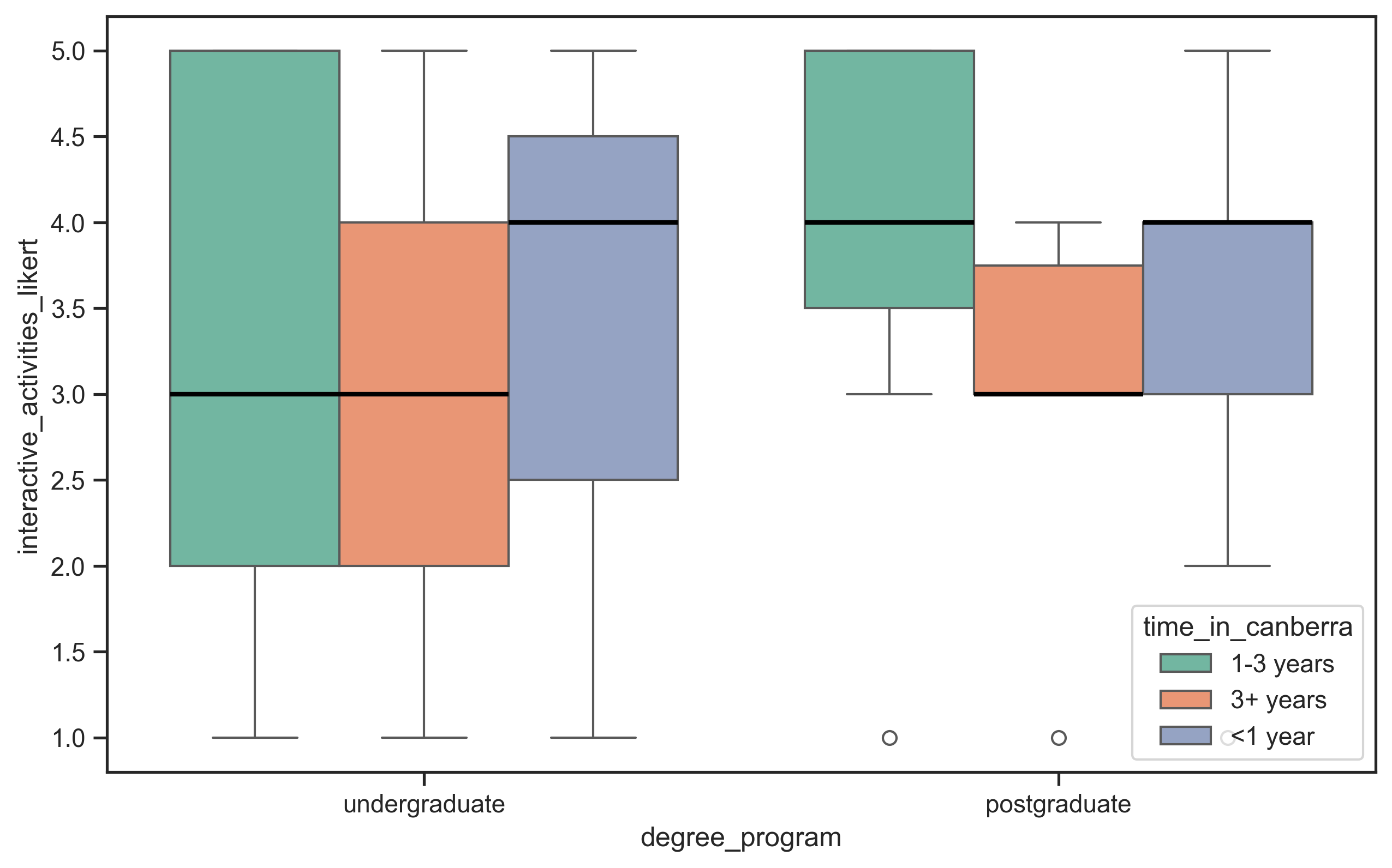
Last chance: answer the questionnaire!
Do: Did you miss the questionnaire at the start of class? Answer it now! (1 minute)
- go to https://pollev.com/charlesmarti205 or scan the QR code
- your answers are about to become our live demo dataset…
Coding in Qualitative Analysis
- in qualitative research the word coding has nothing to do with programming
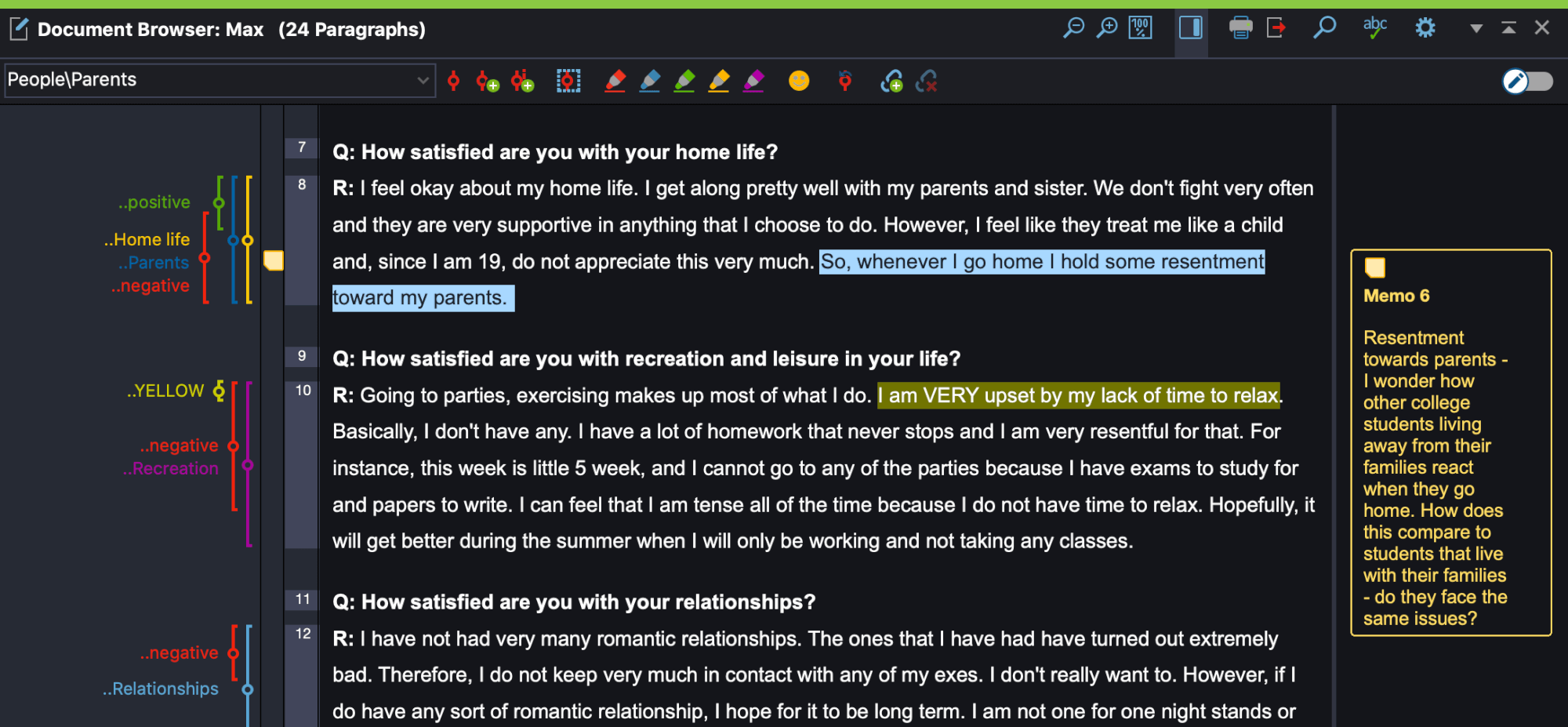
- coding: annotating data with key words or phrases that provide a means for analysis over a large corpus
- codes can be inductive (bottom up, from the data) or deductive (top-down start with a framework of codes) (Braun & Clarke, 2006)
- challenges: creating meaningful, non-overlapping codes that are clearly defined and determining granularity
- inter-rater reliability measures the clarity and reliability of the coding scheme rather than correctness of analysis (McDonald et al., 2019)
- can be done with a text editor or dedicated software (NVivo, MAXQDA)
Analysing Video Material
- initial viewing involves watching entire recording while writing high-level narrative and noting timestamps of interesting events
- chronological and video times used to index events
- data augmentation: video plus screen captures, interaction logs, transcriptions
- coding schemes applied systematically to ensure reliability and consistency
- team-based coding can address subjectivity, ambiguity, and potential errors
- expert knowledge can help with unclear codes and supports interpretation

Identifying Themes
- Many qualitative research approaches distill themes from collected data.
- code the data (apply labels) and then create higher level themes from codes.
- (Reflexive) Thematic Analysis (RTA) (Braun & Clarke, 2022) is a well-known and accessible methodology.
Typical process
- Familiarise with the data
- Coding (short labels, multiple rounds)
- Generating initial themes
- Developing, reviewing, and refining themes
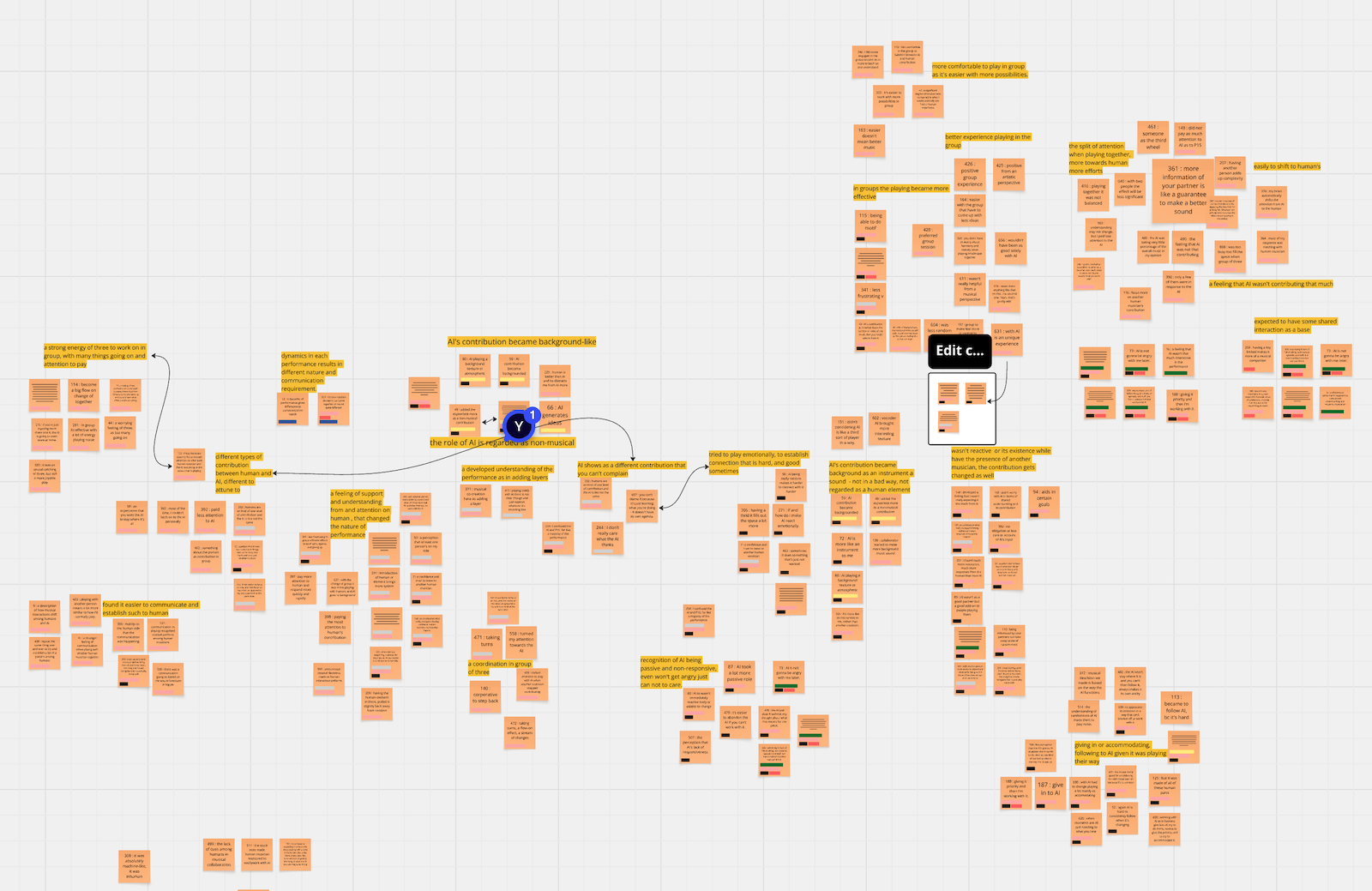
Affinity Diagram
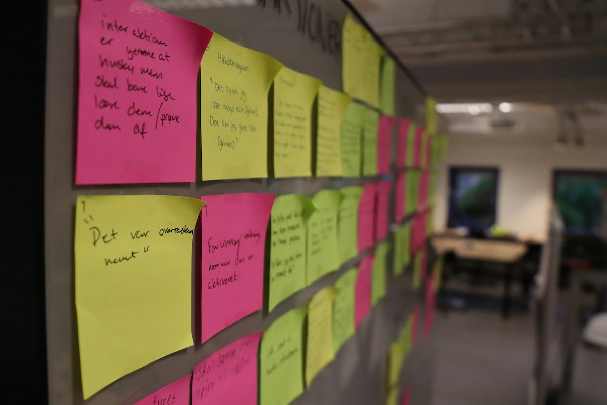
- affinity diagrams used for organising large amounts of data and identifying themes and overall narratives, a core part of contextual design (Beyer & Holtzblatt, 1997)
- both digital (e.g., Miro) and physical (e.g., sticky notes) diagramming approaches
- not necessarily a lot to this: summarise the data on notes, and arrange to find relationships between them.
- my PhD/master/Honours students tend to do this with Miro
- See this resource for a guide.
Questions: Who has a question?
Who has a question?
- I can take catchbox questions up until 2:55
- For after class questions: meet me outside the classroom at the bar (for 30 minutes)
- Feel free to ask about any aspect of the course
- Also feel free to ask about any aspect of computing at ANU! I may not be able to help, but I can listen.